01 · Case Study
Cendre
A dark luxury chocolate brand, built end to end. Identity system, interactive brand guide, working minisite.
01 · Case Study
A dark luxury chocolate brand, built end to end. Identity system, interactive brand guide, working minisite.
The Brief
Cendre is a self directed project. I set the brief myself, and held myself to a higher bar than a client would have asked for.
My day job moves fast: campaigns, landing pages, systems built to scale across markets. Cendre is the opposite on purpose. One brand, one focus, get every detail right the way the immersive, motion led sites I admire are built (Locomotive, CANALS Amsterdam). No client feedback loop, no ship date. Just deciding for myself when something was actually done.
It's the project that shows what I can do with no constraints beyond my own standards.
The Identity
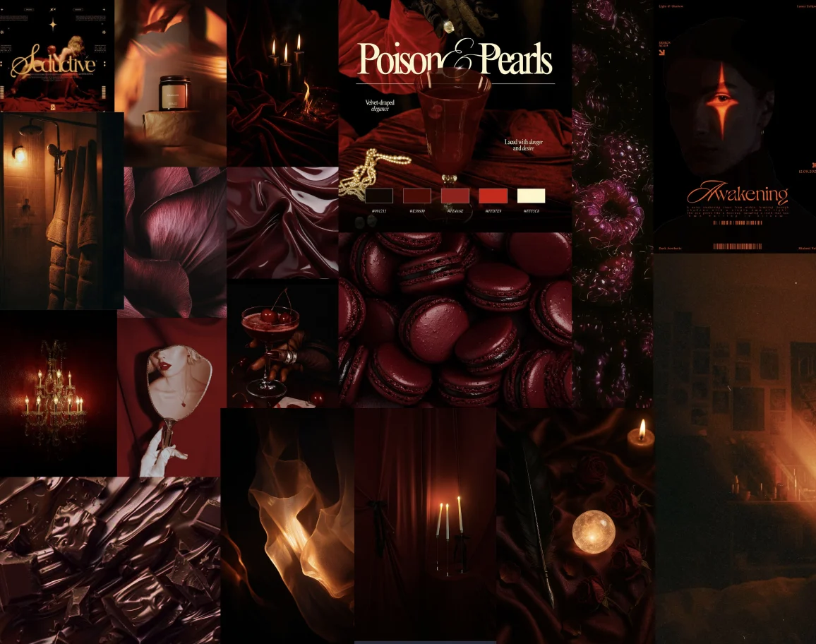
Before any of the interactive work, Cendre needed an identity that could hold its own without motion or scroll behind it. The palette is almost entirely dark, plum and near black, with one warm accent, Spun Caramel, carrying the rest of the attention. I chose not to reach for gold on white the way most luxury food brands do. Restraint reads as expensive faster than decoration does.
Type pairs PP Editorial New, a high contrast serif, against Commissioner, a plain grotesk. The serif carries the drama, the grotesk stays out of the way. Every headline gets weight without needing a second decorative typeface fighting it for attention.
The voice follows the same logic as the visuals: plain, direct, grounded in real detail about the chocolate itself. No comparisons that put other brands down to make Cendre look better. If the writing had to lean on that kind of contrast to sound premium, the brand wasn't actually saying anything.


Gradients
The Brand Guide
Rather than a static PDF nobody opens twice, the brand guide is a working interactive document, eleven sections covering logo usage, colour, type, voice, and packaging, built the same way the rest of Cendre was: coded, not mocked up.
The packaging section is the clearest proof of the system holding together end to end. Five chocolate variants, one repeating gold mark, a single wordmark treatment across wrapper, box, and ribbon. Every rule set earlier in the guide (restraint, one accent colour, no printed gold, only applied) shows up again here, on an actual product.
View the full brand guideThe Hardest Decision
Arrival went through a full typographic composition before it went through the version that's live now.
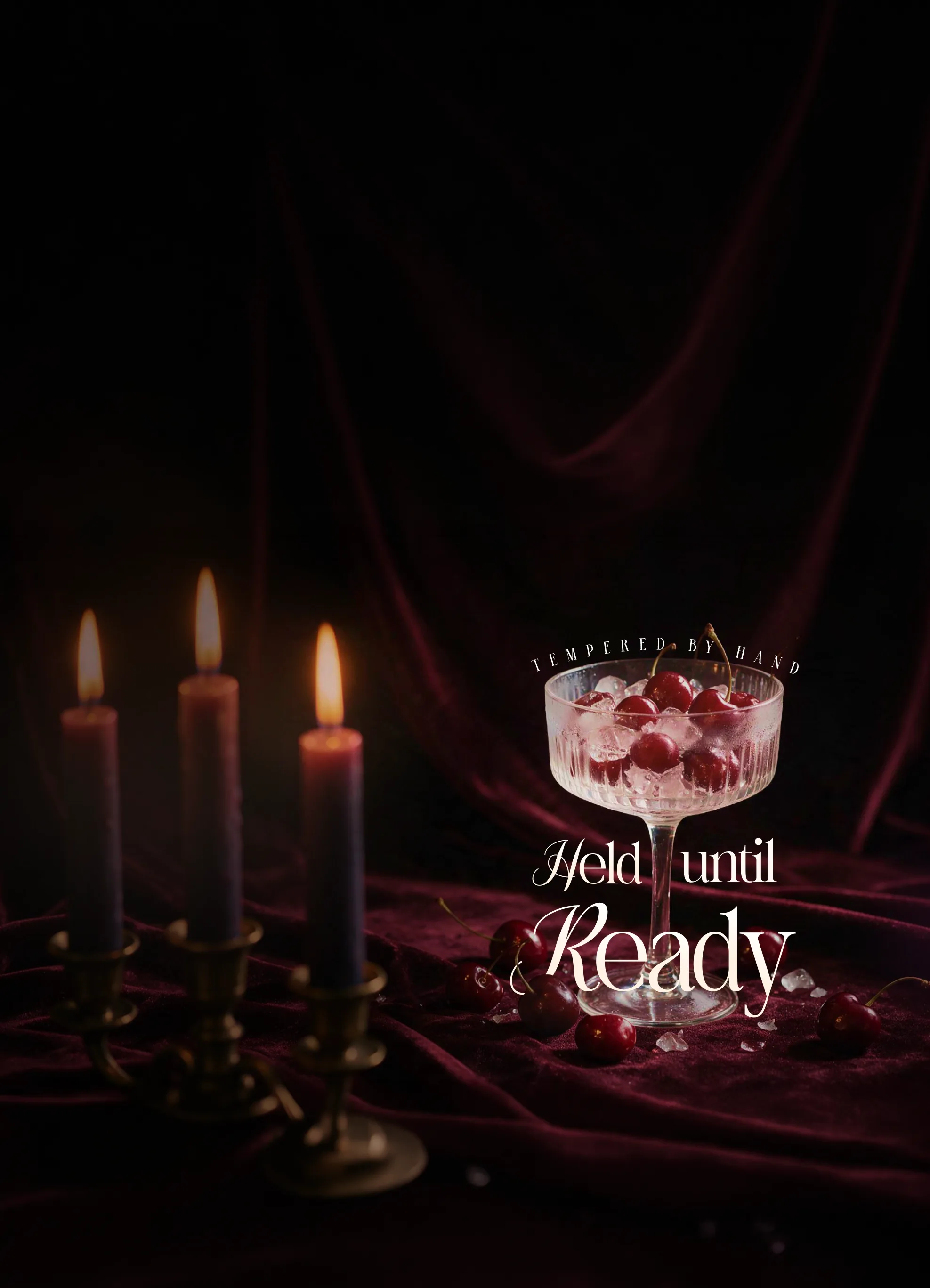
The early build carried the whole locked line, "Cendre. Tempered by hand. Held until ready.", as a typography treatment, lines physically interlocking, one baseline sitting inside the negative space of the line above it. It worked. It also worked against the thing Arrival needed to do most.
The section's real focal point is a cursor interaction, a trail of amber smoke that follows the pointer across the dark field. A dense typography treatment competes with that for attention, and the eye can't do both at once. So the headline came out. What's left is the wordmark, a flame mark, and a few small corner fragments, enough to establish the brand and the chapter without fighting the thing that actually makes the section feel alive.
The typography work wasn't wasted, it's still the treatment used in the case study hero above. But knowing when a strong idea is fighting a stronger one, and cutting it rather than trying to make both work, was the actual decision here.
Earlier · typography treatment

Live · cursor trail
The Experience
The centerpiece is a six chapter scroll site: Arrival, The Founder, The Obsession, The Ritual, The Collection, The Invitation. Every chapter reveals on scroll. No chapter repeats what the last one already said.
Try It
Chapter five stops narrating and starts working. Build a gift, a chocolate slab or a box of pralines, place flavours with a tap, add a name to the ribbon, add it to a cart. Try it below.
Closing Thought
Cendre is the project I'd point to first in an interview. Not because it's the most commercial thing I've built, but because it shows how I actually think, down to the four seconds a headline takes to land, or the exact overlap that makes two lines of type read as one object instead of two. That instinct is the same one behind campaign work and brand systems. It's just easier to see here, with no deadline forcing a shortcut.