

Brand Guide

01 · Identity
Logo



02 · Identity
Logo Usage
Clear space
Maintain clear space around the logo equal to 10% of the logo width on all sides.
Minimum size
Do not reproduce the logo at less than 80px wide in digital contexts, or 25mm in print.
Never
- Stretch or distort the logo
- Recolour outside approved palette
- Place on busy backgrounds without contrast
- Separate the icon from the wordmark
03 · Palette
Colour
Gradients
04 · Type
Typography
Fonts in use
Ideal font size & pairings
Headers
Subheaders
Each piece is shaped by hand, tempered with intention, and finished under candlelight.
05 · Marks
Iconography
The Cendre star, drawn from the flame and the four directions of craft: source, temper, form, finish.
On dark surfaces
Use the light icon.
On light surfaces
Use the dark icon.
Stands alone as a stamp, emboss mark, or favicon, never as a substitute for the full wordmark.
06 · Language
Brand Voice
A premium voice that exudes sophistication, confidence and exclusivity, while speaking the same language as the people who seek it out.
Tone of voice is how the brand expresses itself: pitch, pace and word choice. Not just what is said, but how it is said.
07 · Product
Packaging
Surface
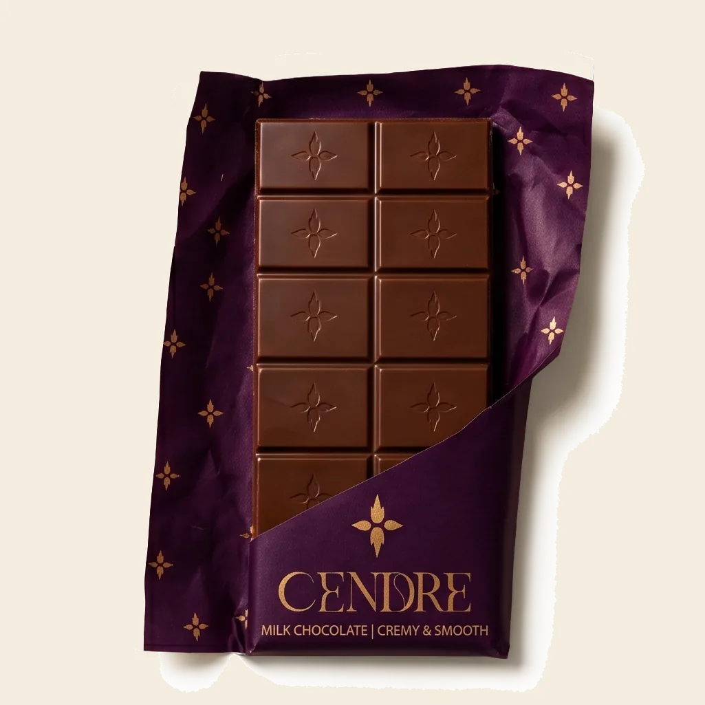
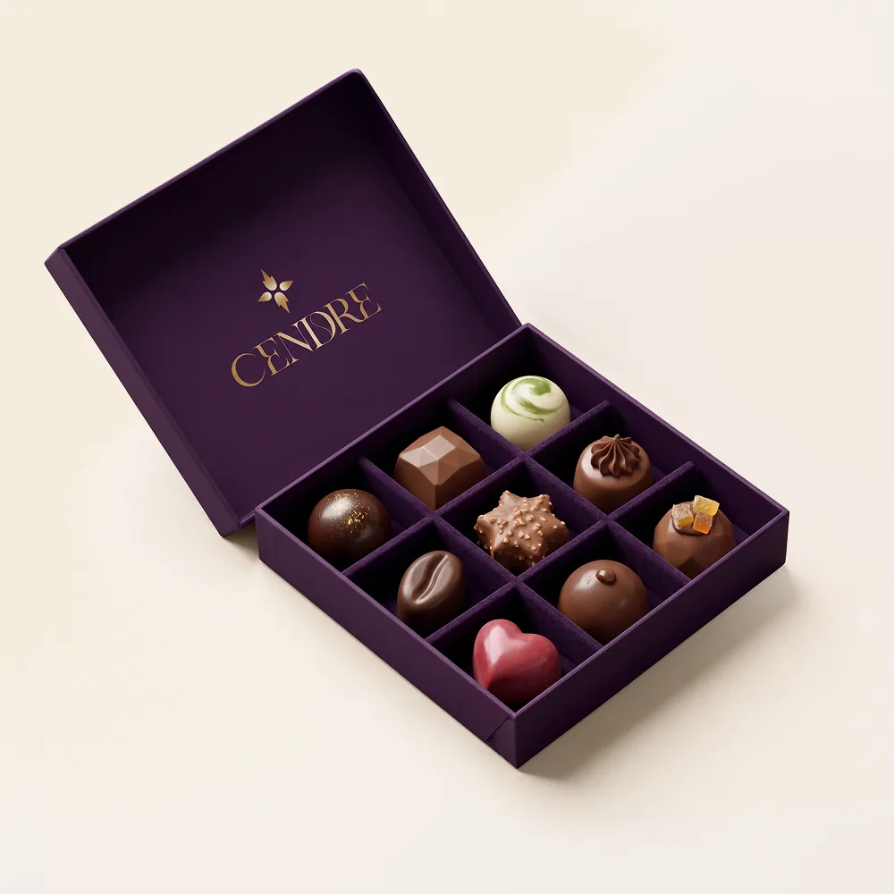
Each variant carries its own colour: deep plum for milk, black for dark, cream for white, dusty rose for ruby, warm tan for caramilk. One gold pattern, the Cendre mark, repeats across every wrapper.
Finish
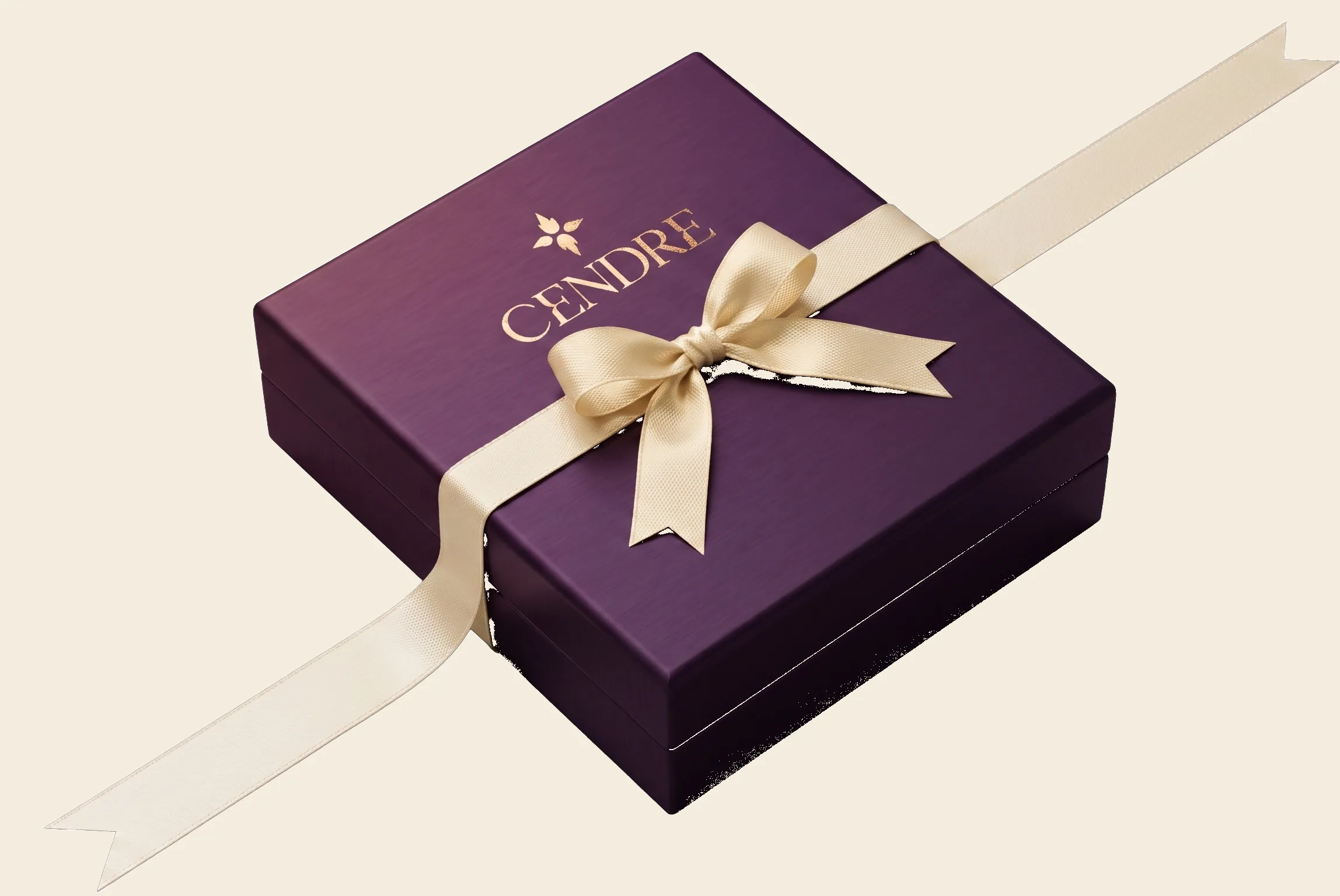
Gold foil for the wordmark and the repeating mark on wrapper and box. On the chocolate itself, the mark is debossed into every square, never printed.
Typography
Wordmark on every wrapper and box. A single line beneath it in Commissioner Ultralight names the variant, nothing more.
Liner
The printed wrapper is a sleeve. Underneath, a plain liner sits directly against the chocolate.
Scale
Packaging sizes are fixed. Cendre does not offer custom sizing, the constraint is part of the ritual.
Ribbon
Gift boxes close with a satin ribbon, not a seal. Every ribbon can carry a name, tied by hand.
08 · In Use
Applications
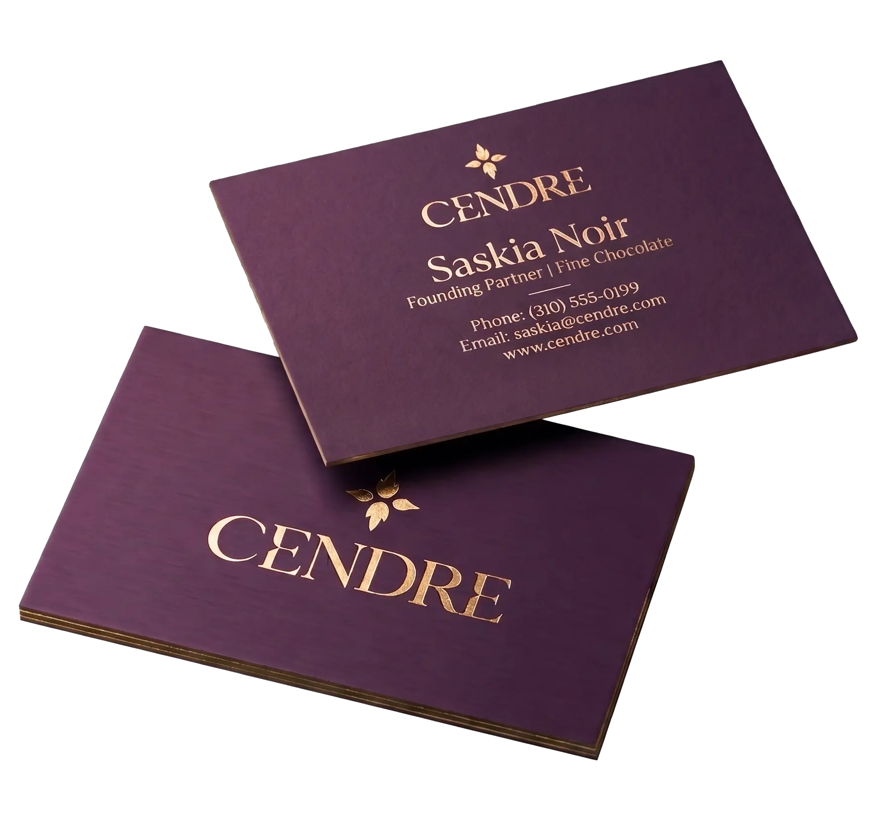
The brand applied across touchpoints. Each application observes the same restraint: dark surface, minimal type, the mark used sparingly.
Business Card
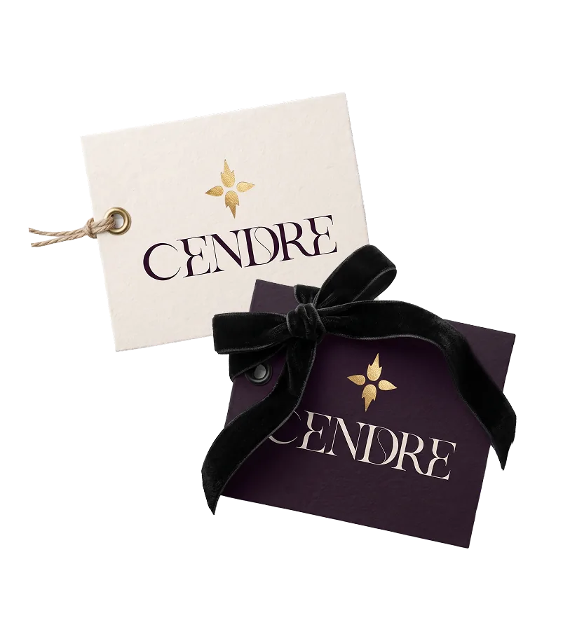
Swing Tag
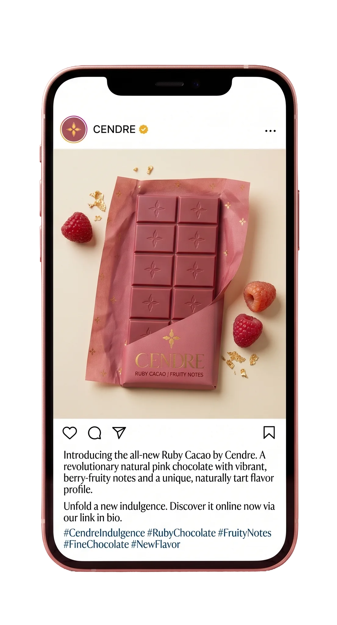
Social
09 · Language
Tone of Voice
In Development
Extended tone guidelines, copy examples across contexts, and editorial style notes will be documented here.
10 · Visual
Photography
In Development
Art direction, lighting references, subject matter guidelines, and composition principles will be documented here.
11 · Behaviour
Motion
In Development
Transition principles, easing values, animation duration standards, and interaction behaviour will be documented here.